Wednesday, 21 December 2016

COP: Japanese Horror Remakes

Part of my research is looking into different kinds of horror, there's lots of ways to split it up. A crucial one is originals vs remakes. A majority of horror films echo the same recipe for scaring its audience, jump scares, foreshadowing and pathetic fallacy. So why are these films remade? 

J - HORROR 

Some films start out in their original country and go on to be a mainstream film. Often American film directors see the fresh fear and decide to jump on it and pump it up with some famous actors, more blood and more scares.

Onryo is a Japanese word used to describe the vengeance in a female ghost who was wronged in life by a man. 
Yurei is a Japanese term used to describe a vengeful spirit (male or female) who was murdered before their time or felt a strong emotion during/ just before their death. 
Onryo/Yurei's are often potrayed with long black unkept hair, in white clothing with white faces. 

RING (1998) vs THE RING (2002) 

Ring 1998 is a Japanese psychological thriller directed by Hideo Nakata. It follows the idea of a cursed tape that kills its viewers after a set amount of time. The villain is a Onryo/Yurei named Sadako, a japanese spirit that was prevented from the afterlife (from a premature murder or from possessing strong emotions). They are the only kind in Japanese Folklore that can physically hurt the living. In this version, there is no depiction of the ghost until the end. The noises heard on the tape are just noises and the imagery is just a mixture of disturbing pictures. The phonecall too is just the noises from the tape. It is only in the last murder in the film that the audience see's it's monster in action (although we do see her corpse it is not the spirit there). 

The Ring 2002 is the western remake. It has all the same elements as its Japanese predecessor but with added embellishments. We are shown how the people are killed in this version, in this one the girls name is Samara and she is a malevolent spirit who in life had the power to burn images into peoples minds. The western version takes from the last murder shown in the japanese version (a girl crawling out of a well scaring a man to death) and adds it into the back story of Samara. Both girl spirits were tortured in both versions, in the japanese version Sadaku is killed by her father, in the american version Samara is killed by her adopted mother (and thrown down a well.. for 7 days.. explaining the whole 7 day reasoning from the Japanese film). The tape is followed up by a voice call in this version. 

Overall the 2002 version seeks to give the Audience more fulfilment, in the 1998 version no attempt to calm the girls spirit is made, no real explanation behind why the tape was made and the viewers are held in suspense much more (the tape has no human voices in the 1998 version).   This is probably because Japanese audiences don't require a backstory for a revengeful spirit, whereas American audiences need reasoning behind everything. WHY was she doing it, HOW can we help her, HOW do we stop her coming after us, WHERE does she come from. 

THE GRUDGE 

After the success of the westernisation of The Ring, remaking Japanese films got it's own name. "J-Horror". The Grudge is another example of this. 

JU-ON: The Grudge (2002) is a Japanese supernatural horror film. It is another film jumping on the fears of Japanese folklore, again with a Onryo/Yurei seeking vengeance for her wrongful murder (at the hands of her husband who also murdered the family). It plays heavily on that Japanese Archetype of a Onryo/Yurei, being unrelenting and unstoppable. In this version everyone who enters the house of the murdered family is eventually murdered by the Yurei of the mother. 

The Grudge (2004) is the western version of the film. It has the same director as the JU-ON version. Unlike some J-Horror films, The Grudge is set in the same country as the original (Tokyo, Japan) and still makes some cultural reference to what kind of ghost it is (rather than in average american horrors it just being a poltergeist). It's plotline is very similar to it's original, leaving one woman at the end to be the final girl in this (Karen) as opposed to the 2002 version where Rika (the Japanese version of Karen) is brutally murdered by the Yurei mother whilst watched by her ghost friends.

The difference between the two again is the 2004 version seeking to give the audience some sense of redemption for the deaths, gifting them the chance to stop the curse (Karen sets the haunted house on fire.. but it survives.. of course). She gets to be the final girl and watch all her friends die, but in the end we know that she too will be killed. 


 CONCLUSIVE THOUGHTS. 
At this point a conclusion can be drawn that American audiences love a hero, they love shreds of hope to hold onto and they need every option to be explored before their final girl can be killed. The Ring 2002 shows us this as Samara's whole backstory is explored and the woman makes an attempt to put her soul to rest before resulting to passing the curse on, unlike the 1998 version where they just figure out how to pass the curse on and thats kind of it.  The Grudge shows us this too, rather than straight out killing the final girl character as the 2002 version does (With Rita.. who experiences lots of violent and horrific encounters before slowly being hunted down by her ghost friends and the murdering Yurei) Karen gets the chance to try and stop the curse by burning the house down, because come on thats what we would all try and do in that situation. The American Audience can then be satisfied that everything to stop this curse has been attempted and when we see that the Yurei mother has come for Karen, we accept it. 


Tuesday, 20 December 2016

COP: Polish Poster Palooza (NEEDS TO BE EDITED))

Since the beginning of COP 3, I knew I wanted it to relate to films in some way or another, as my essay question developed the natural progression of my practical did too. In my initial statement I talk about wanting to create movie posters. As the weeks of my practical have progressed I've moved further away from trying to draw the characters in my own style, and closer to collage to create a scene as I did in my About The Author Brief last year. The movies I've been looking into are all very atmospheric and I think collage might be the way forward for it to create a feeling. When I spoke to Pete about this he suggested talking to Ben, so that rather than going straight into making collages I could look into collage relating to movie and learn about the background. 

POLISH POSTERS 
So I went to speak to him and he showed me a lot of different practitioners and explained why Polish posters are so different to western ones. During ww2 Polish culture was suppressed to the extreme by Nazi Germany and the Soviet Union to the point where thousands of artists and scholars were executed. The polish people were only allowed to display posters that had been approved by the invaders, and during the war they didn't want any american propaganda so posters were not allowed to contain the faces or bodies of actors within them. Polish people created underground networks to develop their art in secret but a mass of works were destroyed and any creative outputs were monitored closely. As a result of this when the war was over and they were no longer occupied by Germans or the Soviet, the Polish art community had a lot of catching up to do. They had missed out on key art periods during their long suppression so Polish art development is very different to the rest of the world so it's only natural that their posters developed differently too. 

Polish posters focus more on the themes and atmosphere of the film, rather than taglines or promoting actors, the posters promote the narrative itself. 

ANDRZEJ KLIMOWSKI 


Andrzej Klimowski is a English Illustrator born to Polish emigre parents but is a well known name in Poland. After being raised among british culture Klimowski moved to Warsaw Poland where he became a well known poster artist. 

His work is very conceptual, often using angels, demons and collage to bring together posters that communicate the theme without revealling too much. Here is his poster for The Omen, a young boy with a demon sat upon his shoulders. In many ways this illustration is far more effective than it's west counterpart as seen below by American Illustrator Tom Jung (seen below it). Although both posters favour the black and white format, Jung's poster has more text to draw the eye from the illustration, I guess everyone has their own opinion on what makes a great poster but for me, I prefer a sense of mystery about a poster. The westernised Jung The Omen poster already tells you what you are in for, through the text and the image of concerned parents onlooking to a young boy. Where in contrast Klimowski's poster reveals nothing other than an unnerving child's body and demonic symbology sat on it's shoulders. It tells us the same (perhaps more) than Jung's version but it is less crowded.. more precise. 

Thursday, 8 December 2016

COP: JAKUB EROL

Whilst looking into Polish Poster artists I stumbled across Jakub Erol. This was mostly because I wanted to see if any polish or Czech artists had covered the texts I'm looking at (Silence of The Lambs, Alien, Carrie, It Follows.) Erol had created a poster for Alien although looking at it that's not what you'd initially assume it was for. 


From this we can see the use of Freudian eyes in the image, but also how the ribcage is incorporated into the illustration so the viewer could also see it as a head as well. This poster is a prime example for why Polish posters are influencing my current work, i love how nothing about the movie's actors or narrative are given away. This poster makes more sense to those who have seen the film but it's still intriguing enough to get public to watch it. It picks up on themes strongly, Freud's Uncanny theory (the fear of castration) is strong within Alien 1979. As the male crew member is impregnated/ robbed of his masculinity. The ribcage being displayed, hints at the nature of the monster. Alien bursts out of his physical chest, but also is fear of the mind/ the unknown.   This poster says more about the movie and it's motives than it's westernised counterpart (pictured below). 


Some of Erol's work is slightly westernised, his poster for terminator does show Arnold's face, but again theres no real hint at him being a robot here. Just a clever use of red and yellow circles which after viewing the movie, we associate with the terminators eyes. 


Erol uses Freudian iconography a lot in his work (aware or not). Pictured below are his posters for Raiders Of The Lost Ark, which is a soft thriller (at a push) family movie yet Erol brings the Uncanny into it again with the loss of eyes and a red rope intertwining the sockets. Nothing about this poster suggests its for the family but it does suggest that there will be frights involved.  


The next image,  is a poster created for Weekend At Bernie's. This film is a comedy film but with dark undertones, this use of hands and eyes hints at this too. The eyes inside glasses hint at the funny but also slightly morbid (Bernie gets involved with the mob.. is killed and then his friend's keep his corpse around so they can party at his house.. weird). The black and white brings a sinister tone to the poster. This is amplified even more so when you look at the western poster comparison (also pictured below) which uses bright colours and also dates the whole thing by the attire worn by the men. 

This is something I really like about Polish and Czech posters.. they feel more like a piece of art than they do  promotion piece. They feel timeless and relevant to now, whereas westernised views of what posters should look like change every few years and look dated very fast (apart from staples in culture, such as the famed Pulp Fiction poster) and leave no lasting impression in the mind. Jakub Erol's thought provoking and disturbing images leave you thinking about the movie, whether that be thinking about going to see it or thinking about how relevant the poster is afterwards.  


Tuesday, 6 December 2016

COP: The Driller Killer.. Controversial Horror


VIDEO NASTIES 

Abel Ferrara is one of the directors that I was told about to look into, mostly after having a discussion about "snuff films" and their influence on horror.  There is also another term coined by the industry "video nasties". Abel Ferrara as he known distinctly for his horror film The Driller Killer which fell into this category. The film was released in the US without any problems but the UK was undergoing a protest to ban video nasties, The Driller Killer was released at the wrong time and only added fuel to the campaign. It came out in 1979 but was banned in the UK from 1983 until 2002. 

THE DRILLER KILLER 

The plot revolves around a depressed artist who goes on a killing spree, he sees an eyeless hallucination of his flatmate Carol (Which references back to what I was talking about earlier, Freudian Theory explains how the loss of eyes is part of the castration complex). This drives the character Reno into a frenzy where lots of graphic murder scenes ensue. 

This was the video cover which caused so much controversy. As far as covers go it is very explicit and I don't think that it's a particularly strong cover either, revealing less is sometimes more especially when it comes down to horror movies (and gory ones at that). 


HORROR TROPES 

The Driller Killer was one of Abel's first films, it was low budget and shot with an unknown cast but contained many themes that are echoed in his other works and which also display clear horror archetypes. One of these is the theme of Religion within horror films, particularly catholic icons which are seen inside DrillerKiller (such as the inverted cross). It also has themes of salvation and redemption which are seen as religious connotations by many (for obvious reasons).  Other tropes is that all the action happens at night, this is seen in Driller Killer but also many horror films choose to have the peak of action happen during the night. It also contains scenes of extreme violence, which is of course a main trope in horror films. 

ABEL FERRARA 
Abel is an independent film maker, which makes his movies even more interesting I think. He doesn't have to follow the horror tropes, but he does. Is this because horror can't exist without them? So many of his films feature explicit violence and he is heralded as a creative in the horror arena, as many of films have a cult following. Abel was raised as a catholic but has reported that for having a large effect within his films. This strongly suggests to me that religion and repression is something that is crucial to a horror move recipe.

He is known mostly for the neo-noir style (all of his films are set in the night) and religious themes within his films. Intentionally or not many of Ferrara's films are sexually charged and violent, Ms 45 (1981) was a rape revenge film (not so many of them around at this time period) where a woman took it into her own hands to seek revenge. 


Monday, 5 December 2016

COP: Olly Moss As An Influence


This is a video I watched on Olly Moss! He was suggested to me to have a look at as most of his work is very minimalist but captures the spirit of the film. For COP I want to do posters (i think) for the final piece so he's worth looking at for my practice.

I like his work but he hasn't done too many horror posters. He has done a lot popular/recognised movies which is something that interests me personally because i like to see a twist put on the posters and I think he manages that. As far as his process goes, he creates the posters in photoshop before and a lot of them are screenprinted (mostly because his work works well screenprinted, and also because he is often comissioned to do limited edition runs of posters for comic cons or special movie premiers).

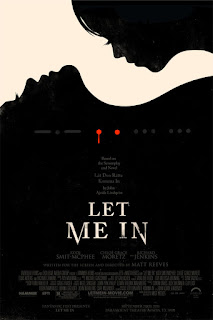
Let Me In (pictured) is a western version of the european horror movie "let the right one in". Although not a stunning poster, it does capture the main themes of the film without revealing too much about the plot. It does reveal two figures, morse code and two red dots placed near the neck, suggesting vampires are involved somehow and linked into this.

Watching the video about his work was good because he talks about how content is inseparable from the medium, so it's important to think about where your work belongs before you make it. He talks about how his earlier stuff wasn't made with Tee Shirts in mind, rather it was an idea he had that he just happened to submit to a TeeShirt company (threadless). He also talks about how a weak execution can ruin a good concept, some of his stuff he points out as having good ideas behind them but the design work is not considered enough to make the work good over all. "Every terrible thing you put on the internet stays there".

COP: Fear of eyes and Freud's The Uncanny

I've been looking into different fears within horror films, one of these being the fear of anything happening to eyes. There are some texts which really inspire this fear.

THE SANDMAN - DER SANDMANN 

The Sandman by E.T.A Hoffman published in 1817 is a story that shows the psychological effects of a scare to a young child. It echoes the Freudian theme of The Uncanny. It follows a man called Nathaniel, who as a child was visited by a man called Coppolla who he refered to as the Sandman. Someone who stole eyes to feed to his children. He is caught by this man and punished, Nathaniel's father stepping in to protect him (and his eyes). Nathaniel is then haunted by the fear of this man and the fear of him stealing eyes for the rest of his life. Eventually being admitted to an asylum when the woman he falls in love with turns out to be an automaton (and her eyes are on the floor in front of him).

FREUDIAN THEORY 

This story is a main text Freud refers to when talking about The uncanny. The loss of eyes/ eyesight as a main theme in the texts, represents symbolic castration by punishment for deviating from the social norms (Nathaniel's screams of horror at the start, his spying on the elders, the punishment was Coppolla attempting to blind him)

By contrasting the German adjective unheimlich with its base word heimlich ("concealed, hidden, in secret"), he proposes that social taboo often yields an aura not only of pious reverence but even more so of horror and even disgust, as the taboo state of an item gives rise to the commonplace assumption that that which is hidden from public eye (cf. the eye or sight metaphor) must be a dangerous threat and even an abomination - especially if the concealed item is obviously or presumingly sexual in nature
(exert from wikipedia).

Freud's Uncanny theory suggests that the lost of an eye is simply a metaphor for castration and the fear of losing our sexuality. "Psychoanalytic experience reminds us that some children have a terrible fear of damaging or losing their eyes. Many retain this anxiety into adult life and fear no physical injury so much as one to the eye. And there is a common saying that one will “guard something like the apple of one’s eye. The study of dreams, fantasies and myths has taught us also that anxiety abut one’s eyes, the fear of going blind, is quite often a substitute for the fear of castration." (The Uncanny, page 139)

APPLIED TO HORROR 

His theory can be applied to horror films, as it would be regarded distasteful to have actual genital  castration on screen during horror films (although it has been done, it hasn't been shown explicitly) Many directors opt for eyes to take their place, as they are something equally important to us. It also relates to childhood fears which remain with us as adults.

Un Chien Andalou is one film I looked into that is a heavily surrealist film, aimed to unnerve the bourgeoisie  Luis Bunuel and Salvador Dali fused their dreams/nightmares into a film. Un Chien Andalou could be regarded as a early horror film as there are things within it that were unnerving (such as a man slicing a woman's eyeball open.. lots of Freudian theory could be applied to it and feminist critics response about that). It was well received by the audience, perhaps one of the first signifiers that people responded to horror well when it was contained on screen.


COP : A Bleeding Shame

B L O O D  F E A R 

Blood in horror films is always very prominent, referred to by film critics as "gore porn" when there is an excessive use of blood within murder scenes but why is it a fear? Blood has strong connotations to the 'monstrous feminine' as they relate to periods and the mood swings that females encounter which have over the years been made into a joke and a shaming method by the other sex. It is also a fear though, fear of talking about nature. They are a taboo subject within society as they have classically been something girls kept to themselves so it only serves that they reflected in horror as a fear and that fear being blood. 

This fear is reflected in Carrie as she gains telekinesis alongside her first period, it was something that is a running theme (the fear of sexuality) throughout the movie so i wanted to research more into where the fear and the taboo of sexuality came from. 

R A D I O  4 P O D C A S T : A BLEEDING SHAME 

I listened to the podcast and then heard about how Walt Disney created a animated short about girls periods but completely side stepped the notion of having sex. This film aired in the 1940s in schools to educate, but in some ways did not address how sex relates to  a women' s cycle. This echoes the tone of the time, they did not talk about sex and everything to do with it was shamed. 

It does address about mood swings but also paints that as something you can "pick yourself up from". 

BRANDING FEAR 

I learnt that period pads came from rebranding bandages from WW1. 
In 1926 Kotex pads were branded as a savior from fear,  "women spend about a sixth of their life in embarrassment and terror". Branding it towards fear, the fear of people knowing and judging you for now reaching that point in puberty. it was also mentioned in the advert that pads were for "better walks of life" ladies, so it was advertised as a luxury product. 

ADVERTS AVOIDANCE 

One of the reasons that blood is seen as such a horror thing is that it is only ever shown within horror films and talked about then. It only has negative connotations in society. Some adverts for menstruation products in 2016 advertised boosting confidence and trying to combat the shame in countries. However TV ad's don't actually address what they are actually for. During the interview in the podcast they ask a leading marketter for a brand about why there is blue ink shown on the pads instead of red and why noone talks about what the product is actually for. 
Head Of Marketing:  tv advertising is still viewed by people together, things you dont want your brothers and fathers hearing 
Interviewer: why not tell men them? Why not highlight that its blood? 
H.O.M: It's something we feel our customers don't want blared out, it gives them the chance to visit our website and find out more. We don't highlight the blood, you have to have approval to air since the 1980s (to show pads). We couldn't talk about the products, we are only just being allowed to show them, but even that is restricted. We cant show them on certain channel, or at a certain time. 
I: So they're not actually banned from showing red ink or using the menstrual period?
H.O.M: No but our adverts can't be seen as causing offence morally or socially and I don't think we're at that place yet. 
I: But you do think that its a possibility? to ditch the blue ink, to diffuse the taboo. 
H.O.M: I wouldn't rule it out, our audience is very progressive, it could happen. 


FEAR THE UNKNOWN. 

I found some examples of the adverts they talked about in the interview. This really is media avoidance of blood and nature. It probably is the fear of the unknown that powers the blood lust in horror because we have so little conversations about it in society.
 If we taught children younger would this allow less fear of blood? Less fear of women? The current advertising is pandering to old fashioned views in my opinion, maybe blood could be de sensationalised if given the chance?
Some recent adverts are relating pads to sexuality and I suppose that could be seen as progressive but I think blood would need to be shown more in the media in order for it to diffuse blood fear within horror films.
Looking into this definitely defined why Blood is so potent in horror films, because it's so so avoided by society today.